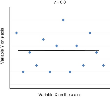
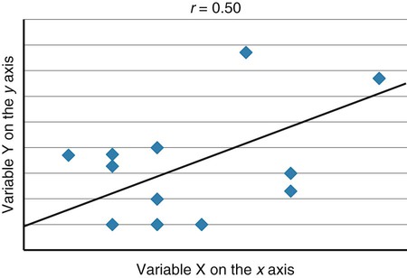
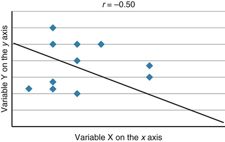
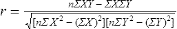
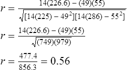
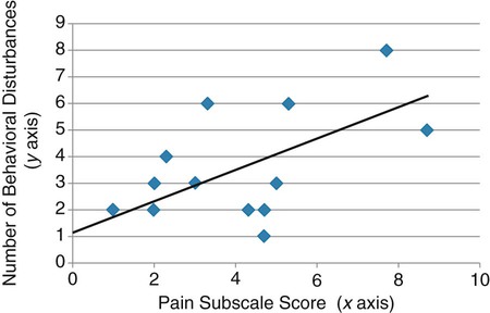
Correlational analyses identify relationships or associations among variables. There are many different kinds of statistics that yield a measure of correlation. All of these statistics address a research question or hypothesis that involves an association or a relationship. Examples of research questions that are answered with correlation statistics are as follows: “Is there an association between weight loss and depression?” “Is there a relationship between patient satisfaction and health status?” A hypothesis is developed to identify the nature (positive or negative) of the relationship between the variables being studied. For example, a researcher may hypothesize that better self-reported health is associated with higher levels of patient satisfaction (Cipher & Hooker, 2006). Scatter plots or scatter diagrams provide useful preliminary information about the nature of the relationship between variables (Corty, 2007; Munro, 2005). The researcher should develop and examine scatter diagrams before performing a correlational analysis. Scatter plots may be useful for selecting appropriate correlational procedures, but most correlational procedures are useful for examining linear relationships only. A scatter plot can easily identify nonlinear relationships; if the data are nonlinear, the researcher should select statistical alternatives such as nonlinear regression analysis (Zar, 1999). A scatter plot is created by plotting the values of two variables on an x-axis and y-axis. As shown in Figure 23-1, pain levels from 14 long-term care residents were plotted against their number of behavioral disturbances (Cipher, Clifford, & Roper, 2006). Specifically, each resident’s pair of values (pain score, behavior value) was plotted on the diagram. Pain was measured with the Geriatric Multidimensional Pain and Illness Inventory (GMPI), and behavioral disturbances were measured by the Geriatric Level of Dysfunction Scale (Clifford, Cipher, & Roper, 2005). The resulting scatter plot reveals a linear trend whereby higher levels of pain tend to correspond with higher behavioral disturbance values. The line drawn in Figure 23-1 is a regression line that represents the concept of least-squares. A least-squares regression line is a line drawn through a scatter plot that represents the smallest deviation of each value from the line (Cohen & Cohen, 1983). Regression analysis is discussed in detail in Chapter 24. Bivariate correlational analysis measures the magnitude of linear relationship between two variables and is performed on data collected from a single sample (Munro, 2005). The particular correlation statistic that is computed depends on the scale of measurement of each variable. Correlational techniques are available for all levels of data: nominal (phi, contingency coefficient, Cramer’s V, and lambda), ordinal (Spearman rank order correlation coefficient, gamma, Kendall’s tau, and Somers’ D), or interval and ratio (Pearson’s product-moment correlation coefficient). Figure 21-7 in Chapter 21 illustrates the level of measurement for which each of these statistics is appropriate. Many of the correlational techniques (Kendall’s tau, contingency coefficient, phi, and Cramer’s V) are used in conjunction with contingency tables, which illustrate how values of one variable vary with values for a second variable. Contingency tables are explained further in Chapter 25. Sometimes the relationship between two variables is curvilinear, which reflects a relationship between the variables that changes over the range of both variables. For example, one of the most famous curvilinear relationships is that of stress and test performance. Test performance tends to be better as test-takers have more stress but only up to a point. When students experience very high stress levels, test performance deteriorates (Lupien, Maheu, Tu, Fiocco, & Schramek, 2007; Yerkes & Dodson, 1908). Analyses designed to test for linear relationships or associations between two variables, such as Pearson’s correlation, cannot detect a curvilinear relationship. Pearson’s product-moment correlation was the first of the correlation measures developed and is the most commonly used (Corty, 2007; Munro, 2005). This coefficient (statistic) is represented by the letter r, and the value of r is always between −1.00 and +1.00. A value of zero indicates no relationship between the two variables. A positive correlation indicates that higher values of X are associated with higher values of Y, and lower values of X are associated with lower values of Y. A negative or inverse correlation indicates that higher values of X are associated with lower values of Y. The r value is indicative of the slope of the line (called a regression line) that can be drawn through a standard scatter plot of the values of two paired variables. The strengths of different relationships are identified in Table 23-1 (Aberson, 2010; Cohen, 1988). Figure 23-2 represents an r value approximately equal to zero, indicating no relationship or association between the two variables. An r value is rarely, if ever, equal to exactly zero. Figure 23-3 shows an r value equal to 0.50, which is a moderate positive relationship. Figure 23-4 shows an r value equal to −0.50, which is a moderate negative or inverse relationship. TABLE 23-1 1. Interval or ratio measurement of both variables (e.g., age, income, blood pressure, cholesterol levels) 2. Normal distribution of at least one variable 3. Independence of observational pairs Data that are homoscedastic are evenly dispersed above and below the regression line, which indicates a linear relationship on a scatter plot. Homoscedasticity reflects equal variance of both variables. In other words, for every value of X, the distribution of Y values should have equal variability. If the data for the two variables being correlated are not homoscedastic, inferences made during significance testing could be invalid (Cohen & Cohen, 1983). Pearson’s product-moment correlation coefficient is computed using one of several formulas; the following formula is considered the “computational formula” because it makes computation by hand easier (Zar, 1999). r = Pearson’s correlation coefficient X = value of the first variable Y = value of the second variable Table 23-2 displays how one would set up data to compute a Pearson’s correlation coefficient. This example includes a subset of data from a study introduced earlier in this chapter of long-term care residents (n = 14) with the most severe levels of dementia (Cipher et al., 2006). A subset of data was selected for this illustration so that the computation example would be small and manageable. In actuality, studies involving correlational analysis need to be adequately powered and involve a larger sample than is used here (Aberson, 2010; Cohen, 1988). However, all data presented in this chapter are actual, unmodified clinical data. TABLE 23-2 Computation of Pearson’s Correlation The first variable in Table 23-2 is the number of behavioral disturbances being exhibited by the residents. The second variable is the residents’ scores on the Pain and Suffering subscale of the GMPI (Clifford & Cipher, 2005). The GMPI is a comprehensive pain assessment instrument that was designed to be used by nurses, social workers, and psychologists to assess pain experienced by a person residing in a long-term care facility. The GMPI Pain and Suffering subscale is scored on a scale of 1 to 10, with higher numbers indicating more severe pain. Higher numbers are also indicative of more behavioral disturbances. The null hypothesis being tested is: There is no significant association between pain and behavioral disturbances among long-term care residents with severe dementia. The data in Table 23-2 are arranged in columns, which correspond to the elements of the formula. The summed values in the last row of Table 23-2 are inserted into the appropriate place in the formula:
Using Statistics to Examine Relationships
 http://evolve.elsevier.com/Grove/practice/
Scatter Diagrams
Bivariate Correlational Analysis
Pearson’s Product-Moment Correlation Coefficient
Strength of Relationship
Positive Relationship
Negative Relationship
Weak relationship
0.00 to <0.30
0.00 to <−0.30
Moderate relationship
0.30 to 0.50
−0.30 to −0.50
Strong relationship
>0.50
>−0.50
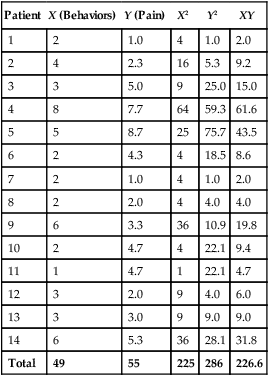
Calculation
Patient
X (Behaviors)
Y (Pain)
X2
Y2
XY
1
2
1.0
4
1.0
2.0
2
4
2.3
16
5.3
9.2
3
3
5.0
9
25.0
15.0
4
8
7.7
64
59.3
61.6
5
5
8.7
25
75.7
43.5
6
2
4.3
4
18.5
8.6
7
2
1.0
4
1.0
2.0
8
2
2.0
4
4.0
4.0
9
6
3.3
36
10.9
19.8
10
2
4.7
4
22.1
9.4
11
1
4.7
1
22.1
4.7
12
3
2.0
9
4.0
6.0
13
3
3.0
9
9.0
9.0
14
6
5.3
36
28.1
31.8
Total
49
55
225
286
226.6
![]()
Stay updated, free articles. Join our Telegram channel

Full access? Get Clinical Tree


Using Statistics to Examine Relationships
Get Clinical Tree app for offline access
