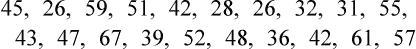
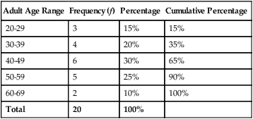
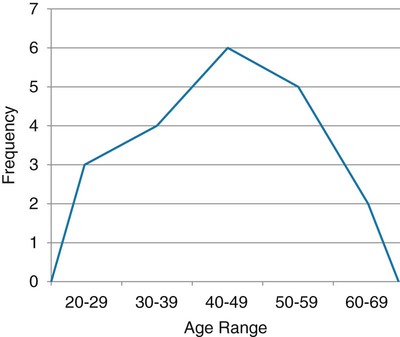
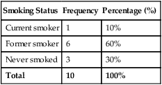
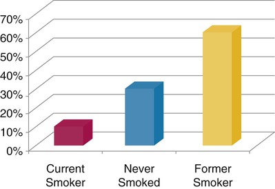
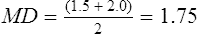
First, we must sort the patients’ ages from lowest to highest values: 26 26 28 31 32 36 39 42 42 43 45 47 48 51 52 55 57 59 61 67 Next, each age value is tallied to create the frequency. This is an example of an ungrouped frequency distribution. In an ungrouped frequency distribution, researchers list all categories of the variable on which they have data and tally each datum on the listing (Corty, 2007). In this example, all the different ages of the 20 patients are listed and then tallied for each age. Because most of the ages in this data set have frequencies of “1,” it is better to group the ages into ranges of values. These ranges must be mutually exclusive. A patient’s age can be classified into only one of the ranges. In addition, the ranges must be exhaustive, meaning that each patient’s age fits into at least one of the categories. For example, we may choose to have ranges of 10, so that the age ranges are 20 to 29, 30 to 39, 40 to 49, 50 to 59, and 60 to 69. We may choose to have ranges of 5, so that the age ranges are 20 to 24, 25 to 29, 30 to 34, and so on. The grouping should be devised to provide the greatest possible meaning to the purpose of the study. If the data are to be compared with data in other studies, groupings should be similar to groupings of other studies in this field of research. Classifying data into groups results in the development of a grouped frequency distribution (Munro, 2005). Table 22-1 presents a grouped frequency distribution of patient ages classified by ranges of 10 years. The range starts at “20” because there are no patient ages lower than 20; also, there are no ages higher than 69. TABLE 22-1 Grouped Frequency Distribution of Patient Ages with Percentages Table 22-1 also includes percentages of patients with an age in each range and the cumulative percentages for the sample, which should add to 100%. This table provides an example of a percentage distribution that indicates the percentage of the sample with scores falling in a specific group or range (Corty, 2007; Munro, 2005). Percentage distributions are particularly useful in comparing the data of the present study with results from other studies. As discussed earlier, frequency distributions can be presented in figures. Frequencies are commonly presented in graphs, charts, histograms, and frequency polygons. Figure 22-1 is a line graph of the frequency distribution for age ranges, where the x-axis (horizontal line) represents the different age ranges, and the y-axis (vertical line) represents the frequencies of patients with ages in each of the ranges. A frequency table is also an important method to represent nominal data (Corty, 2007; Munro, 2005; Tukey, 1977). For example, a common nominal variable is smoking history. Many researchers assess subjects’ history of smoking using nominal categories such as “never smoked,” “former smoker,” and “current smoker.” Table 22-2 presents frequency and percentage distributions for data extracted from a sample of veterans with rheumatoid arthritis (Tran, Hooker, Cipher, & Reimold, 2009). TABLE 22-2 Frequency Table of Smoking Status As shown in Table 22-2, the frequencies indicate that 6 of 10 (60%) veterans were former smokers, and 3 (30%) never smoked. For nominal variables such as smoking status, tables are a helpful method to inform researchers and others about the variable being studied. Graphically representing the values in a frequency table can yield visually important trends. Figure 22-2 is a histogram that was developed to represent the smoking status data visually. A measure of central tendency is a statistic that represents the center or middle of a frequency distribution (Corty, 2007; Glass & Stanley, 1970; Grove, 2007). The three measures of central tendency commonly reported in nursing studies include mode, median (MD), and mean ( TABLE 22-3 Data of Medication Use in Veterans with Rheumatoid Arthritis Duration of Medication Use (years) 0.1 0.3 1.3 1.5 1.5 2.0 2.2 3.0 3.0 4.0 The letter “n” is lowercase because we are referring to a sample of veterans. If the data being presented represented the entire population of veterans, the correct notation would be uppercase “N” (Zar, 1999). Because most nursing research is conducted using samples, not populations, all formulas in Chapters 22 to 25 incorporate the sample notation, n. The mode is the numerical value or score that occurs with the greatest frequency in a data set. It does not indicate the center of the data set. The data in Table 22-3 contain two modes: 1.5 years and 3.0 years of medication use. Each of these numbers occurred twice in the data set. When two modes exist, the data set is referred to as bimodal (see Chapter 21). A data set that contains more than two modes is referred to as multimodal (Zar, 1999). The median (MD) is the score at the exact center of the ungrouped frequency distribution. It is the 50th percentile. To obtain the MD, sort the values from lowest to highest. If the number of values is an uneven number, exactly 50% of the values are above the MD and 50% are below it. If the number of values is an even number, the MD is the average of the two middle values; thus, the MD may not be an actual value in the data set (Zar, 1999). For example, the data in Table 22-3 consist of 10 observations, and the MD is calculated as the average of the two middle values.
Using Statistics to Describe Variables
 http://evolve.elsevier.com/Grove/practice/
Using Statistics to Summarize Data
Frequency Distributions
Age
Frequency
26
2
28
1
31
1
32
1
36
1
39
1
42
2
43
1
45
1
47
1
48
1
51
1
52
1
55
1
57
1
59
1
61
1
67
1
Adult Age Range
Frequency (f)
Percentage
Cumulative Percentage
20-29
3
15%
15%
30-39
4
20%
35%
40-49
6
30%
65%
50-59
5
25%
90%
60-69
2
10%
100%
Total
20
100%
Smoking Status
Frequency
Percentage (%)
Current smoker
1
10%
Former smoker
6
60%
Never smoked
3
30%
Total
10
100%
Measures of Central Tendency
 ) (Corty, 2007; Munro, 2005). The mode, median, and mean are defined and calculated in this section using data collected from veterans with rheumatoid arthritis (Tran et al., 2009). The data were extracted from a larger sample of veterans who had a history of biologic medication use. Examples of common biologic medications used to treat rheumatoid arthritis are adalimumab, etanercept, and infliximab (Deighton, O’Mahony, Tosh, Turner, & Rudolf, 2009). Table 22-3 contains the data collected from 10 veterans who had stopped taking biologic medications, and the variable represents the number of years that each veteran had taken the medication before the veteran stopped. Because the number of study subjects represented is 10, the correct statistical notation to reflect that number is:

Mode
Median
Using Statistics to Describe Variables

 = mean


Get Clinical Tree app for offline access
