Describe the four levels of measurement and identify which level was used for measuring specific variables
 Describe characteristics of frequency distributions and identify and interpret various descriptive statistics
 Describe the logic and purpose of parameter estimation and interpret confidence intervals
 Describe the logic and purpose of hypothesis testing and interpret p values
 Specify appropriate applications for t-tests, analysis of variance, chi-squared tests, and correlation coefficients and interpret the meaning of the calculated statistics
 Understand the results of simple statistical procedures described in a research report
 Identify several types of multivariate statistics and describe situations in which they could be used
 Identify indexes used in assessments of reliability and validity
 Define new terms in the chapter
Key Terms
 Absolute risk (AR)
 Absolute risk reduction (ARR)
 Alpha (α)
 Analysis of covariance (ANCOVA)
 Analysis of variance (ANOVA)
 Central tendency
 Chi-squared test
 Coefficient alpha
 Cohen’s kappa
 Confidence interval (CI)
 Continuous variable
 Correlation
 Correlation coefficient
 Correlation matrix
 Crosstabs table
 d statistic
 Descriptive statistics
 Effect size
 F ratio
 Frequency distribution
 Hypothesis testing
 Inferential statistics
 Interval measurement
 Intraclass correlation coefficient (ICC)
 Level of measurement
 Level of significance
 Logistic regression
 Mean
Mean
 Median
 Mode
Mode
 Multiple correlation coefficient

 Multivariate statistics
 N
N
 Negative relationship
 Nominal measurement
 Nonsignificant result (NS)
 Normal distribution
 Number needed to treat (NNT)
 Odds ratio (OR)
 Ordinal measurement
 p value
 Parameter
 Parameter estimation
 Pearson’s r
 Positive relationship
 Predictor variable
 r
r
 R2
R2
 Range
Range
 Ratio measurement
 Repeated measures ANOVA
 Sensitivity
 Skewed distribution
 Spearman’s rho
 Specificity
 Standard deviation
 Statistic
 Statistical test
 Statistically significant
 Symmetric distribution
 Test statistic
 t-test
 Type I error
 Type II error
 Variability
Statistical analysis is used in quantitative research for three main purposes—to describe the data (e.g., sample characteristics), to test hypotheses, and to provide evidence regarding measurement properties of quantified variables (see Chapter 10). This chapter provides a brief overview of statistical procedures for these purposes. We begin, however, by explaining levels of measurement.
 | TIP Although the thought of learning about statistics may be anxiety-provoking, consider Florence Nightingale’s view of statistics: “To understand God’s thoughts we must study statistics, for these are the measure of His purpose.” |
LEVELS OF MEASUREMENT
Statistical operations depend on a variable’s level of measurement. There are four major levels of measurement.
Nominal measurement, the lowest level, involves using numbers simply to categorize attributes. Gender is an example of a nominally measured variable (e.g., females = 1, males = 2). The numbers used in nominal measurement do not have quantitative meaning and cannot be treated mathematically. It makes no sense to compute a sample’s average gender.
Ordinal measurement ranks people on an attribute. For example, consider this ordinal scheme to measure ability to perform activities of daily living (ADL): 1 = completely dependent, 2 = needs another person’s assistance, 3 = needs mechanical assistance, and 4 = completely independent. The numbers signify incremental ability to perform ADL independently, but they do not tell us how much greater one level is than another. As with nominal measures, the mathematic operations with ordinal-level data are restricted.
Interval measurement occurs when researchers can rank people on an attribute and specify the distance between them. Most psychological scales and tests yield interval-level measures. For example, the Stanford-Binet Intelligence (IQ) test is an interval measure. The difference between a score of 140 and 120 is equivalent to the difference between 120 and 100. Many statistical procedures require interval data.
Ratio measurement is the highest level. Ratio scales, unlike interval scales, have a meaningful zero and provide information about the absolute magnitude of the attribute. Many physical measures, such as a person’s weight, are ratio measures. It is meaningful to say that someone who weighs 200 pounds is twice as heavy as someone who weighs 100 pounds. Statistical procedures suitable for interval data are also appropriate for ratio-level data. Variables with interval and ratio measurements often are called continuous variables.
Example of different measurement levels
Grønning and colleagues (2014) tested the effect of a nurse-led education program for patients with chronic inflammatory polyarthritis. Gender and diagnosis were measured as nominal-level variables. Education (10 years, 11 to 12 years, 13+ years) was an ordinal measurement. Many outcomes (e.g., self-efficacy, coping) were measured on interval-level scales. Other variables were measured on a ratio level (e.g., age, number of hospital admissions).
Researchers usually strive to use the highest levels of measurement possible because higher levels yield more information and are amenable to powerful analyses.
 | HOW-TO-TELL TIP How can you tell a variable’s measurement level? A variable is nominal if the values could be interchanged (e.g., 1 = male, 2 = female OR 1 = female, 2 = male). A variable is usually ordinal if there is a quantitative ordering of values AND if there are a small number of values (e.g., excellent, good, fair, poor). A variable is usually considered interval if it is measured with a composite scale or test. A variable is ratio level if it makes sense to say that one value is twice as much as another (e.g., 100 mg is twice as much as 50 mg). |
DESCRIPTIVE STATISTICS
Statistical analysis enables researchers to make sense of numeric information. Descriptive statistics are used to synthesize and describe data. When indexes such as averages and percentages are calculated with population data, they are parameters. A descriptive index from a sample is a statistic. Most research questions are about parameters; researchers calculate statistics to estimate parameters and use inferential statistics to make inferences about the population.
Descriptively, data for a continuous variable can be depicted in terms of three characteristics: the shape of the distribution of values, central tendency, and variability.
Frequency Distributions
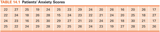
Data that are not organized are overwhelming. Consider the 60 numbers in Table 14.1. Assume that these numbers are the scores of 60 preoperative patients on an anxiety scale. Visual inspection of these numbers provides little insight into patients’ anxiety.
Frequency distributions impose order on numeric data. A frequency distribution is an arrangement of values from lowest to highest and a count or percentage of how many times each value occurred. A frequency distribution for the 60 anxiety scores (Table 14.2) makes it easy to see the highest and lowest scores, where scores clustered, and how many patients were in the sample (total sample size is designated as N in research reports).
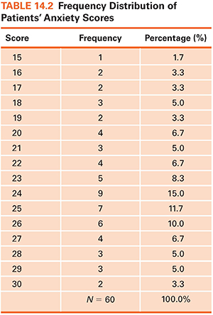
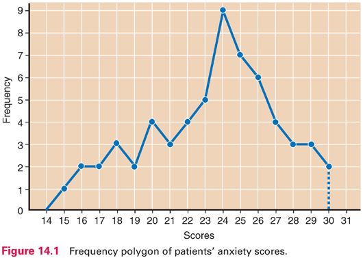
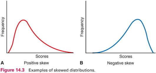
Frequency data can be displayed graphically in a frequency polygon (Fig. 14.1). In such graphs, scores typically are on the horizontal line, and counts or percentages are on the vertical line. Distributions can be described by their shapes. Symmetric distribution occurs if, when folded over, the two halves of a frequency polygon would be superimposed (Fig. 14.2). In an asymmetric or skewed distribution, the peak is off center, and one tail is longer than the other. When the longer tail points to the right, the distribution has a positive skew, as in Figure 14.3A. Personal income is positively skewed: Most people have moderate incomes, with only a few people with high incomes at the distribution’s right end. If the longer tail points to the left, the distribution has a negative skew (Fig. 14.3B). Age at death is negatively skewed: Most people are at the far right end of the distribution, with fewer people dying young.
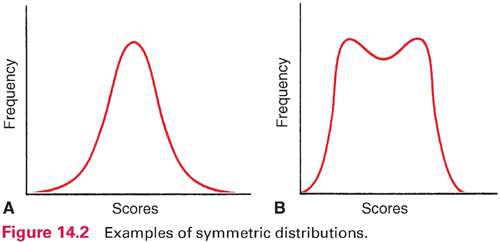
Another aspect of a distribution’s shape concerns how many peaks it has. A unimodal distribution has one peak (Fig. 14.2A), whereas a multimodal distribution has two or more peaks—two or more values of high frequency. A distribution with two peaks is bimodal (Fig. 14.2B).
A special distribution called the normal distribution (a bell-shaped curve) is symmetric, unimodal, and not very peaked (Fig. 14.2A). Many human attributes (e.g., height, intelligence) approximate a normal distribution.
Central Tendency
Frequency distributions clarify patterns, but an overall summary often is desired. Researchers ask questions such as “What is the average daily calorie consumption of nursing home residents?” Such a question seeks a single number to summarize a distribution. Indexes of central tendency indicate what is “typical.” There are three indexes of central tendency: the mode, the median, and the mean.
 Mode: The mode is the number that occurs most frequently in a distribution. In the following distribution, the mode is 53:
50 51 51 52 53 53 53 53 54 55 56
The value of 53 occurred four times, more than any other number. The mode of the patients’ anxiety scores in Table 14.2 was 24. The mode identifies the most “popular” value.
 Median: The median is the point in a distribution that divides scores in half. Consider the following set of values:
2 2 3 3 4 5 6 7 8 9
The value that divides the cases in half is midway between 4 and 5; thus, 4.5 is the median. The median anxiety score is 24, the same as the mode. The median does not take into account individual values and is insensitive to extremes. In the given set of numbers, if the value of 9 were changed to 99, the median would remain 4.5.
 Mean: The mean equals the sum of all values divided by the number of participants—what we usually call the average. The mean of the patients’ anxiety scores is 23.4 (1,405 ÷ 60). As another example, here are the weights of eight people:
85 109 120 135 158 177 181 195
In this example, the mean is 145. Unlike the median, the mean is affected by the value of every score. If we exchanged the 195-pound person for one weighing 275 pounds, the mean would increase from 145 to 155 pounds. In research articles, the mean is often symbolized as M or X (e.g., X = 145).
For continuous variables, the mean is usually reported. Of the three indexes, the mean is most stable: If repeated samples were drawn from a population, the means would fluctuate less than the modes or medians. Because of its stability, the mean usually is the best estimate of a population central tendency. When a distribution is skewed, however, the median is preferred. For example, the median is a better index for “average” (typical) income than the mean because income is positively skewed.
Variability
Two distributions with identical means could differ with respect to how spread out the data are—how different people are from one another on the attribute. This section describes the variability of distributions.
Consider the two distributions in Figure 14.4, which represent hypothetical scores for students from two schools on an IQ test. Both distributions have a mean of 100, but school A has a wider range of scores, with some below 70 and some above 130. In school B, there are few low or high scores. School A is more heterogeneous (i.e., more varied) than school B, and school B is more homogeneous than school A. Researchers compute an index of variability to express the extent to which scores in a distribution differ from one another. Two common indexes are the range and standard deviation.
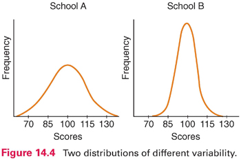
 Range: The range is the highest minus the lowest score in a distribution. In our anxiety score example, the range is 15 (30 − 15). In the distributions in Figure 14.4, the range for school A is about 80 (140 − 60), whereas the range for school B is about 50 (125 − 75). The chief virtue of the range is ease of computation. Because it is based on only two scores, however, the range is unstable: From sample to sample drawn from a population, the range can fluctuate greatly.
 Standard deviation: The most widely used variability index is the standard deviation. Like the mean, the standard deviation is calculated based on every value in a distribution. The standard deviation summarizes the average amount of deviation of values from the mean.* In the example of patients’ anxiety scores (Table 14.2), the standard deviation is 3.725. In research reports, the standard deviation is often abbreviated as SD.
 | TIP SDs sometimes are shown in relation to the mean without a label. For example, the anxiety scores might be shown as M = 23.4 (3.7) or M = 23.4 ± 3.7, where 23.4 is the mean and 3.7 is the SD. |
An SD is more difficult to interpret than the range. For the SD of anxiety scores, you might ask 3.725 what? What does the number mean? We can answer these questions from several angles. First, the SD is an index of how variable scores in a distribution are, and so, if (for example) male and female patients had means of 23.0 on the anxiety scale, but their SDs were 7.0 and 3.0, respectively, it means that females were more homogeneous (i.e., their scores were more similar to one another).
The SD represents the average of deviations from the mean. The mean tells us the best value for summarizing an entire distribution, and an SD tells us how much, on average, the scores deviate from the mean. An SD can be interpreted as our degree of error when we use a mean to describe an entire sample.
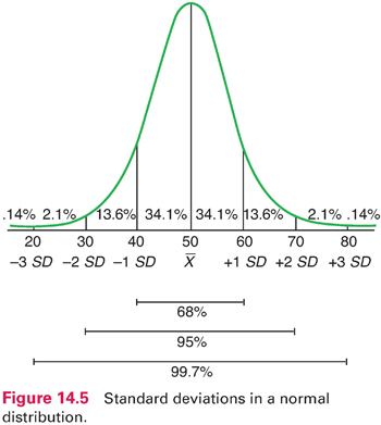
In normal and near-normal distributions, there are roughly three SDs above and below the mean, and a fixed percentage of cases fall within certain distances from the mean. For example, with a mean of 50 and an SD of 10 (Fig. 14.5), 68% of all cases fall within 1 SD above and below the mean. Sixty-eight percent of all cases fall within 1 SD above and below the mean. Thus, nearly 7 of 10 scores are between 40 and 60. In a normal distribution, 95% of the scores fall within 2 SDs of the mean. Only a handful of cases—about 2% at each extreme—lie more than 2 SDs from the mean. Using this figure, we can see that a person with a score of 70 achieved a higher score than about 98% of the sample.
 | TIP Descriptive statistics (percentages, means, SDs) are most often used to describe sample characteristics and key research variables and to document methodological features (e.g., response rates). They are seldom used to answer research questions—inferential statistics usually are used for this purpose. |
Example of descriptive statistics
Awoleke and coresearchers (2015) studied factors that predicted delays in seeking care for a ruptured tubal pregnancy in Nigeria. They presented descriptive statistics about participants’ characteristics. The mean age of the 92 women in the sample was 30.3 years (SD = 5.6); 76.9% were urban dwellers, 74.7% were married, and 27.5% had no prior births. The mean duration of amenorrhea before hospital presentation was 5.5 weeks (SD = 4.0).
Bivariate Descriptive Statistics
So far, our discussion has focused on univariate (one-variable) descriptive statistics. Bivariate (two-variable) descriptive statistics describe relationships between two variables.
Crosstabulations
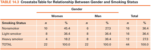
A crosstabs table is a two-dimensional frequency distribution in which the frequencies of two variables are crosstabulated. Suppose we had data on patients’ gender and whether they were nonsmokers, light smokers (<1 pack of cigarettes a day), or heavy smokers (≥1 pack a day). The question is whether men smoke more heavily than women, or vice versa (i.e., whether there is a relationship between smoking and gender). Fictitious data for this example are shown in Table 14.3. Six cells are created by placing one variable (gender) along one dimension and the other variable (smoking status) along the other dimension. After subjects’ data are allocated to the appropriate cells, percentages are computed. The crosstab shows that women in this sample were more likely than men to be nonsmokers (45.4% vs. 27.3%) and less likely to be heavy smokers (18.2% vs. 36.4%). Crosstabs are used with nominal data or ordinal data with few values. In this example, gender is nominal, and smoking, as operationalized, is ordinal.
Relationships between two variables can be described by correlation methods. The correlation question is: To what extent are two variables related to each other? For example, to what degree are anxiety scores and blood pressure values related? This question can be answered by calculating a correlation coefficient, which describes intensity and direction of a relationship.
Two variables that are related are height and weight: Tall people tend to weigh more than short people. The relationship between height and weight would be a perfect relationship if the tallest person in a population was the heaviest, the second tallest person was the second heaviest, and so on. A correlation coefficient indicates how “perfect” a relationship is. Possible values for a correlation coefficient range from −1.00 through .00 to +1.00. If height and weight were perfectly correlated, the correlation coefficient would be 1.00 (the actual correlation coefficient is in the vicinity of .50 to .60 for a general population). Height and weight have a positive relationship because greater height tends to be associated with greater weight.
When two variables are unrelated, the correlation coefficient is zero. One might anticipate that women’s shoe size is unrelated to their intelligence. Women with large feet are as likely to perform well on IQ tests as those with small feet. The correlation coefficient summarizing such a relationship would be in the vicinity of .00.
Correlation coefficients between .00 and −1.00 express a negative (inverse) relationship. When two variables are inversely related, higher values on one variable are associated with lower values in the second. For example, there is a negative correlation between depression and self-esteem. This means that, on average, people with high self-esteem tend to be low on depression. If the relationship were perfect (i.e., if the person with the highest self-esteem score had the lowest depression score and so on), then the correlation coefficient would be −1.00. In actuality, the relationship between depression and self-esteem is moderate—usually in the vicinity of −.30 or −.40. Note that the higher the absolute value of the coefficient (i.e., the value disregarding the sign), the stronger the relationship. A correlation of −.50, for instance, is stronger than a correlation of +.30.
The most widely used correlation statistic is Pearson’s r (the product–moment correlation coefficient), which is computed with continuous measures. For correlations between variables measured on an ordinal scale, researchers usually use an index called Spearman’s rho. There are no guidelines on what should be interpreted as strong or weak correlations because it depends on the variables. If we measured patients’ body temperature orally and rectally, an r of .70 between the two measurements would be low. For most psychosocial variables (e.g., stress and depression), however, an r of .70 would be high.
Correlation coefficients are often reported in tables displaying a two-dimensional correlation matrix, in which every variable is displayed in both a row and a column, and coefficients are displayed at the intersections. An example of a correlation matrix is presented at the end of this chapter.
Example of correlations
Elder et al. (2016) investigated sleep and activity as they relate to body mass index and waist circumference (WC). They found a modest positive correlation between WC and sedentary activity (r = .17) and a modest negative correlation between sleep duration and WC (r = −.11).
Describing Risk
The evidence-based practice (EBP) movement has made decision making based on research findings an important issue. Several descriptive indexes can be used to facilitate such decision making. Many of these indexes involve calculating risk differences—for example, differences in risk before and after exposure to a beneficial intervention.
We focus on describing dichotomous outcomes (e.g., had a fall/did not have a fall) in relation to exposure or nonexposure to a beneficial treatment or protective factor. This situation results in a 2 × 2 crosstabs table with four cells. The four cells in the crosstabs table in Table 14.4 are labeled, so various indexes can be explained. Cell a is the number of cases with an undesirable outcome (e.g., a fall) in an intervention/protected group, cell b is the number with a desirable outcome (e.g., no fall) in an intervention/protected group, and cells c and d are the two outcome possibilities for a nontreated/unprotected group. We can now explain the meaning and calculation of some indexes of interest to clinicians.
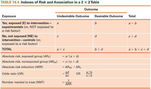
Absolute Risk
Absolute risk can be computed for those exposed to an intervention/protective factor and for those not exposed. Absolute risk (AR) is simply the proportion of people who experienced an undesirable outcome in each group. Suppose 200 smokers were randomly assigned to a smoking cessation intervention or to a control group (Table 14.5). The outcome is smoking status 3 months later. Here, the AR of continued smoking is .50 in the intervention group and .80 in the control group. Without the intervention, 20% of those in the experimental group would presumably have stopped smoking anyway, but the intervention boosted the rate to 50%.
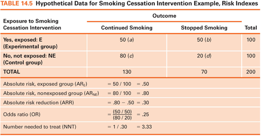
Absolute Risk Reduction
The absolute risk reduction (ARR) index, a comparison of the two risks, is computed by subtracting the AR for the exposed group from the AR for the unexposed group. This index is the estimated proportion of people who would be spared the undesirable outcome through exposure to an intervention/protective factor. In our example, the value of ARR is .30: 30% of the control group subjects would presumably have stopped smoking if they had received the intervention, over and above the 20% who stopped without it.
The odds ratio is a widely reported risk index. The odds, in this context, is the proportion of people with the adverse outcome relative to those without it. In our example, the odds of continued smoking for the intervention group is 1.0: 50 (those who continued smoking) divided by 50 (those who stopped). The odds for the control group is 80 divided by 20, or 4.0. The odds ratio (OR) is the ratio of these two odds—here, .25. The estimated odds of continuing to smoke are one-fourth as high among intervention group members as for control group members. Turned around, the estimated odds of continued smoking is 4 times higher among smokers who do not get the intervention as among those who do.
Example of odds ratios
Draughon Moret and colleagues (2016) examined factors associated with patients’ acceptance of nonoccupational postexposure prophylaxis (nPEP) for HIV following sexual assault; many results were reported as ORs. For example, patients were nearly 13 times more likely to accept the offer of nPEP if they were assaulted by more than one assailant (OR = 12.66).
Number Needed to Treat
The number needed to treat (NNT) index estimates how many people would need to receive an intervention to prevent one undesirable outcome. NNT is computed by dividing 1 by the ARR. In our example, ARR = .30, and so NNT is 3.33. About three smokers would need to be exposed to the intervention to avoid one person’s continued smoking. The NNT is valuable because it can be integrated with monetary information to show if an intervention is likely to be cost-effective.
 | TIP Another risk index is known as relative risk (RR). The RR is the estimated proportion of the original risk of an adverse outcome (in our example, continued smoking) that persists when people are exposed to the intervention. In our example, RR is .625 (.50 / .80): The risk of continued smoking is estimated as 62.5% of what it would have been without the intervention. |
INTRODUCTION TO INFERENTIAL STATISTICS
Descriptive statistics are useful for summarizing data, but researchers usually do more than describe. Inferential statistics, based on the laws of probability, provide a means for drawing inferences about a population, given data from a sample. Inferential statistics are used to test research hypotheses.
Sampling Distributions
Inferential statistics are based on the assumption of random sampling of cases from populations—although this assumption is widely ignored. Even with random sampling, however, sample characteristics are seldom identical to those of the population. Suppose we had a population of 100,000 nursing home residents whose mean score on a physical function (PF) test was 500 with an SD of 100. We do not know these parameters—assume we must estimate them based on scores from a random sample of 100 residents. It is unlikely that we would obtain a mean of exactly 500. Our sample mean might be, say, 505. If we drew a new random sample of 100 residents, the mean PF score might be 497. Sample statistics fluctuate and are unequal to the parameter because of sampling error. Researchers need a way to assess whether sample statistics are good estimates of population parameters.
To understand the logic of inferential statistics, we must perform a mental exercise. Consider drawing 5,000 consecutive samples of 100 residents per sample from the population of all residents. If we calculated a mean PF score each time, we could plot the distribution of these sample means, as shown in Figure 14.6. This distribution is a sampling distribution of the mean. A sampling distribution is theoretical: No one actually draws consecutive samples from a population and plots their means. Statisticians have shown that sampling distributions of means are normally distributed, and their mean equals the population mean. In our example, the mean of the sampling distribution is 500, the same as the population mean.
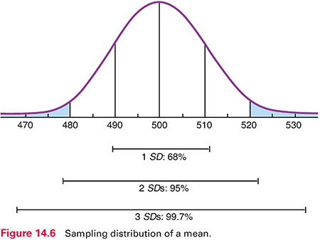
For a normally distributed sampling distribution of means, the probability is 95 out of 100 that a sample mean lies between +2 SD and −2 SD of the population mean. The SD of the sampling distribution—called the standard error of the mean (or SEM)—can be estimated using a formula that uses two pieces of information: the SD for the sample and sample size. In our example, the SEM is 10 (Fig. 14.6), which is the estimate of how much sampling error there would be from one sample mean to another in an infinite number of samples of 100 residents.
We can now estimate the probability of drawing a sample with a certain mean. With a sample size of 100 and a population mean of 500, the chances are 95 out of 100 that a sample mean would fall between 480 and 520—2 SDs above and below the mean. Only 5 times out of 100 would the mean of a random sample of 100 residents be greater than 520 or less than 480.
The SEM is partly a function of sample size, so an increased sample size improves the accuracy of the estimate. If we used a sample of 400 residents to estimate the population mean, the SEM would be only 5. The probability would be 95 in 100 that a sample mean would be between 490 and 510. The chance of drawing a sample with a mean very different from that of the population is reduced as sample size increases.
You may wonder why you need to learn about these abstract statistical notions. Consider, though, that we are talking about the accuracy of researchers’ results. As an intelligent consumer, you need to evaluate critically how believable research evidence is so that you can decide whether to incorporate it into your nursing practice.
Parameter Estimation
Statistical inference consists of two techniques: parameter estimation and hypothesis testing. Parameter estimation is used to estimate a population parameter—for example, a mean, a proportion, or a difference in means between two groups (e.g., smokers vs. nonsmokers). Point estimation involves calculating a single statistic to estimate the parameter. In our example, if the mean PF score for a sample of 100 nursing home residents was 510, this would be the point estimate of the population mean.
Point estimates convey no information about the estimate’s margin of error. Interval estimation of a parameter provides a range of values within which the parameter has a specified probability of lying. With interval estimation, researchers construct a confidence interval (CI) around the point estimate. The CI around a sample mean establishes a range of values for the population value and the probability of being right. By convention, researchers use either a 95% or a 99% CI.
 | TIP CIs address a key EBP question for appraising evidence, as presented in Box 2.1: How precise is the estimate of effects? Stay updated, free articles. Join our Telegram channel
Full access? Get Clinical Tree
 Get Clinical Tree app for offline access
Get Clinical Tree app for offline access

|