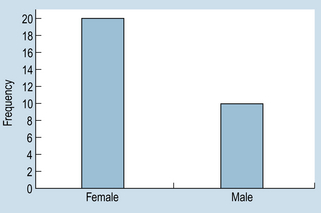
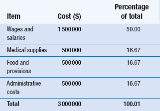
15 The aims of this chapter are to: 1. Outline methods for organizing and representing data in the form of frequency distributions, tables or graphs. 2. Demonstrate how the measurement scale used for data collection influences the organization and presentation of the evidence. 3. Discuss the calculation and use of some simple descriptive statistics for discontinuous data, including percentages, ratios and rates. A primary consideration in selecting appropriate statistics is the question of whether the data are discrete or continuous. Scaled data are necessarily discrete, so that the organization of the data involves counting the number (frequency) of cases falling into each category of measurement. Let us examine two hypothetical examples as an illustration. Example 1: nominal (categorical) data Grouping the above nominal data involves counting the number of cases (or measurements) falling into each category. The total is M = 10 and F = 20. The data can be presented in tabular form. Table 15.1 shows the following conventions in tabulating data: Table 15.1 Frequency distribution of gender of patients undergoing cholecystectomy at a hospital over a period of 1 year 1. Tables must be clearly and fully labelled – both the table as a whole and the categories – so that readers can interpret unambiguously what they are observing. 2. f represents frequency of cases or measurements falling into a given category. 3. n represents the total number of cases or measurements in a sample. 4. N represents the number of cases in a population. (See Section 3 for the difference between samples and populations.) Experimental group: 3, 4, 5, 3, 3, 3, 4, 2, 1, 3, 2, 1, 3, 4, 5, 2, 3, 3, 3, 3 Control group: 5, 4, 4, 4, 5, 3, 4, 3, 2, 4, 4, 2, 4, 5, 3, 4, 4, 4, 5, 5 After tallying the results, the above data can be presented as a frequency distribution, as shown in Table 15.2. This demonstrates that, when the data have been tabulated, we can see the outcome of the investigation. Here, the pain reported by the experimental group is less than that of the control group. Organizing the data is the first step in producing evidence for testing the hypothesis that the new analgesic is more effective than placebo. Table 15.2 Reported pain intensity of patients following placebo and analgesic treatments Once a frequency distribution of the raw data has been tabulated, a variety of techniques is available for the graphical presentation of a given set of measurements. Frequency distributions of qualitative data are often plotted as bar graphs (also termed ‘column’ graphs), or shown pictorially as pie diagrams. A bar graph involves plotting the frequency of each category and drawing a bar, the height of which represents the frequency of a given category. Figure 15.1 graphs the data given in Table 15.1. Figure 15.1 demonstrates conventions in plotting bar graphs: 1. The y-axis, also called the ordinate, is used to plot frequencies. 2. The x-axis, also called the abscissa, is used to indicate the categories. 3. The bars do not touch each other, reflecting the discontinuity of the measurement categories. It can be seen in Figure 15.2 that, by presenting the data for the experimental and control groups on the same graph, the reader gains a visual impression of the possible effectiveness of the analgesic treatment in contrast to that of the control intervention or treatment. Nominal data can also be meaningfully presented as a pie chart, where the percentage of each category is converted into a proportional part of a circle or ‘pie’. For example, in a given hospital we have the hypothetical spending patterns shown in Table 15.3.
Organization and presentation of data
Introduction
The organization and presentation of nominal or ordinal data
Organization of discrete data
Gender
f
Male (M)
10
Female (F)
20
n = 30
Example 2: ordinal data
Pain intensity
Experimental group (analgesic)
f
Control group (placebo)
f
1
2
0
2
3
2
3
10
3
4
3
10
5
2
5
n = 20
n = 20
Graphing discrete data
![]()
Stay updated, free articles. Join our Telegram channel

Full access? Get Clinical Tree


Organization and presentation of data
Get Clinical Tree app for offline access


