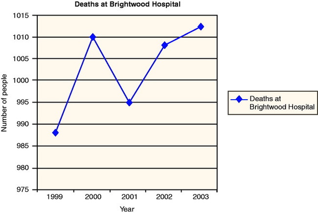
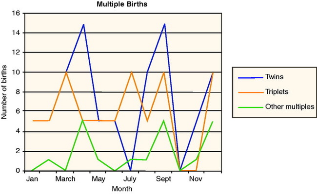
Upon completion of this chapter, the learner will be able to: 1. Define the key terms that relate to the chapter. 2. Discuss how graphs can be used in the health care fields. 3. Transcribe information on the correct chart. Number of people seen at Brightwood Hospital per year Here is the same information plotted as a line graph. 1. Identify the vertical (“y”) axis and the horizontal (“x”) axis with specific labels. 2. Determine the scale for each variable. 3. Plot each value for the data set. If you are comparing more than one data set, use different colors. Identify each data set in the chart key. 4. Using a ruler, connect the data set points to create a line. Use the above strategies to plot the information from the following data set: Here is what the line graph would look like: 1. Use graph paper or a computer to plot the following data to create a line graph. 2. The following data set represents the number of patients seen in a physician’s office per day for one month. 3. The following data set represents the number of males and females ages 12 to 18 seen in the laboratory in the first half of the year. Create a chart to represent the data sets. 4. Answer the following questions based on the graph below. a. What year had the lowest number of deaths at Brightwood Hospital? ______________________ b. What year had the greatest number of deaths at Brightwood Hospital? ______________________ c. How many deaths occurred at Brightwood Hospital in 2002? ______________________ d. How many deaths occurred at Brightwood Hospital in 2001? ______________________ 5. Answer the following questions based on the graph below. a. Which months had the greatest number of other multiple births? ______________________ b. In what month were there no twins born at Brightwood Hospital? ______________________ c. In what month were the most triplets born? ______________________ d. Which month(s) had the greatest number of multiple births? ______________________ e. Which month(s) had the most twin births? ______________________ Look at Figure 12-1. Which part of the chart is considered the vital sign graphic sheet? By viewing the graphic sheet, you can easily tell when the patient’s temperature was above normal (98.6° F).
Graphs
Tool of Organization
Objective 2
Graphs
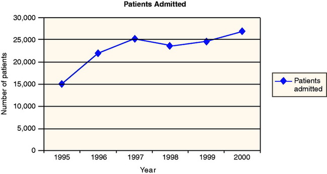
Year
Number of People Seen
1995
15,000
1996
22,000
1997
25,000
1998
23,500
1999
24,500
2000
26,500
Objective 2
 STRATEGY 12-1: Creating a Line Graph Manually
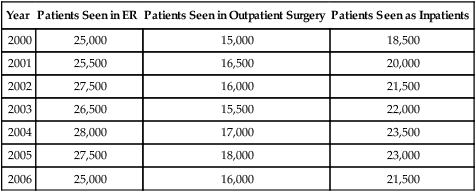
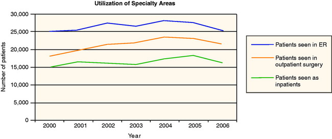
Year
Patients Seen in ER
Patients Seen in Outpatient Surgery
Patients Seen as Inpatients
2000
25,000
15,000
18,500
2001
25,500
16,500
20,000
2002
27,500
16,000
21,500
2003
26,500
15,500
22,000
2004
28,000
17,000
23,500
2005
27,500
18,000
23,000
2006
25,000
16,000
21,500
Year
Live Infants Born
2000
550
2001
475
2002
575
2003
600
2004
525
2005
500
2006
625
Monday
32
Tuesday
26
Wednesday
22
Thursday
28
Friday
32
Saturday
17
January
150 males
175 females
February
112 males
145 females
March
125 males
115 females
April
100 males
120 females
May
90 males
85 females
June
75 males
90 females
Objective 3
Measurement graphs
Vital Sign Graphs
![]()
Stay updated, free articles. Join our Telegram channel

Full access? Get Clinical Tree


Graphs: Tool of Organization
 MATH IN THE REAL WORLD 12-1: Graphs in the Health Care Setting

 STRATEGY 12-2: Creating a Chart on the Computer
 PRACTICE THE SKILL 12-1
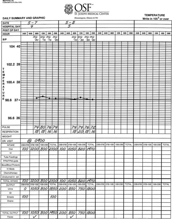
 MATH IN THE REAL WORLD: Vital Signs (T, P, R, and BP)
Get Clinical Tree app for offline access
